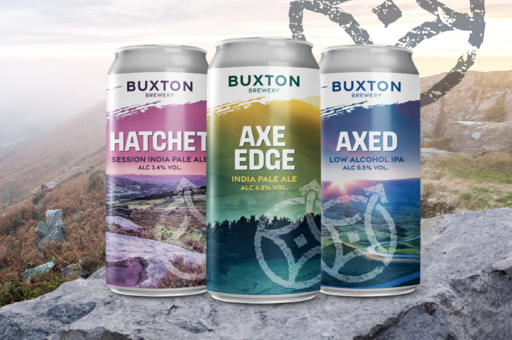
Buxton Brewery has revealed a brand refresh that “perfectly captures the innovative and adventurous heart and soul of our independent brewery” and gives us a credible, ownable platform to take Buxton Brewery to the next level.
In a statement, the team said: “Our rebrand began with our central story, because, like every great explorer all great brands have a great story to tell. We know our customers share an adventurous, outdoorsy mindset with us, love our unique location in the Peak District and have an equally adventurous approach to trying new beers. This inspired our new narrative.
“We released the designers into the wild to give us new look and feel. They returned with a new compass-inspired graphic that’s both a nod to that exploring mindset and to our own adventurous, restless approach to brewing, together with a new logo font that’s unmistakeably Buxton Brewery but with a fresh cut.”
Revamped beer names
“You’ll also notice some tweaks to the beer names in our core range. Naturally, flagship names like Axe Edge remain unchanged, while others have been renamed to follow in its footsteps. Now they’re all on the same path, inspired by our Peak District location, with a more relaxed focus on story telling rather than a sermon about ingredients.”


