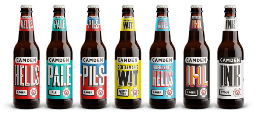
Camden Town Brewery has updated its website, alongside its bottles, cans, boxes and tap badges.
The new look employs bold background colours and strong typography to ensure the beer name, style and ‘Camden’ name stands out, the company explained.
“The bold and colourful design creates more consistency across products, whilst retaining Camden’s playful and irreverent tone of voice,” they added.
Earlier this year, the company confirmed that it will be opening a new brewery in Enfield next year.
With plans to employ 70 staff over the next two years, it expects to be brewing at the new site from next spring.
Speaking at the time, Jasper Cuppaidge, founder of Camden Town Brewery said last year’s acquisition by AB InBev has given them the opportunity to transform Camden Town Brewery from “an outstanding London brewery to a world famous one”.
He added: “With the support of ABI and this new addition to our family, built to our exacting standards. Enfield will not only keep all our brewing close to home in North London, but also enable us to make more great beers to satisfy the thirst of beer lovers out there, and maintain our commitment to full flavoured and distinct beers.
This increased capacity means Camden will expand its small pack portfolio of Unfiltered Hells and Ink in both cans and bottles, as well Pils and Wit in cans and IHL in bottles.
Mark Turner, managing director at Camden Town Brewery, added: “This refresh is part of our wider strategy to bring great craft beer to more people.
“The bold branding will really stand out on shelves, with engaging product information that appeals to consumers, giving another great reason to purchase.”


